Johnny Thief is an amazing tattooer, a legendary poster artist and a damn fine human being. (I still sip the 12 year old Scotch he gifted to me a few birthdays ago.) This primer on Lettering in Tattoos is from his Seppuku Tattoo blog. It should be required reading for anyone interested in getting a Script tattoo.
The Letter of the Law: Laws for Lettering and Tattoos
Im taking the time to blog about all text tattoos due to the overwhelming amount of lettering were doing. We often turn down requests for massive amounts of type & I wanted to spell out our very concrete reason as to why that is. This isnt to discourage anyone from getting tattooed, but rather to look at the broad picture & to help make better tattoo choices.
I realize its a current fad to get scads of text, we see it all the time. And it drives us crazy. Below are bullet points of why.
TEXT TATTOOS DESTROY THE ART OF TYPOGRAPHY: Just like every other art form, typography has its own rules & limitations. Before computers loaded with hundreds of fonts downloaded for free, typography was a specialized profession, & typographers were very proud crafters of type. Good type is readable because of weight, form, size, leading, tracking, & kerning. Its designed to be read on flat surfaces, with maximum contrast between very dark lettering; very light grounds.
You, dear tattoo client, are not flat white paper. Youre a series of interlocking muscle bands, youre covered with skin that is anything but white. You are cylindrical, almost every part of you body is long; rounded. But its not rounded evenly, like a pole, each surface is tapered, being much wider at some points; narrower at others. Youre also topographical, with some points rising; dipping dramatically. On top of all that, youre also flexible, so unless youve been stuffed by an expert taxidermist, the minute you move, you will morph into even more elastic contorted shapes. When you try to apply text to this living organic medium, the lines waver, the letter size changes, the spacing inside the letter closes up, the spacing between the letters; between the words run together. It looks like crap. And Guttenberg spins in his grave.
This is why no one has invented billboards for telephone poles or railings, because no one could read it.
TEXT TATTOOS FIGHT ANATOMY: The best tattoos, as the Japanese knew hundreds of years ago, work with the body, not fight against it. Thats why they would design full sleeves; body suits with total saturation, to flow with the muscle groups. This is also why some Asian art may seem two dimensional on paper, but the same art on a body springs to life. Your flesh adds the missing third dimension, its graphic nature is powerful enough to be seen from across the room. Strong. Powerful. Classic.
Text does the opposite of this. It needs negative space in order to be legible, since its read in lines left to right, it needs to be straight, slicing up all that flowing anatomy into ribbons, graphically speaking. It becomes a visual road block, destroying your natural curves. This is why you dont see straight lines or geometric shapes in tattoo flash, every flat surface gets twisted, corkscrewed, warped. Thats not because of all the acid we did in college, its to conform our art with the flow of your physique. If type is snaked along the lines with the muscles, it trashes the leading, it quickly becomes illegible, defeats the whole point of getting text.
TEXT TATTOOS FIGHT GOOD TATTOOING: Good tattoos use a lot of graphic tricks to fight the fact that tattoos are on a curvy stretchy colored surface that will age for up to sixty to eighty years. Good placement (filling up the spot on the body the right way), design (using symbols graphic tools to maximize an illustrated message), layout (using the given space to its fullest potential), full contrast (going from 100% black to 100% white), color theory (using a full chroma range, complimenting colors for maximum effects), elaborate textures are used to create readable, powerful forms the eye instantly recognizes. Text has none of these tools, it takes every one of these tools out of the hands of the artist.
At the end of the day, type, no matter how cool the font, is really just skinny tribal, look how cool all those 80s tribal armbands turned out to be.
I had a recent client request map coordinates in his chosen font, which I was happy to do, but before his appointment, he complained that the art was lacking dimension that I should work my magic to prevent this. Well, the fact that I was expelled from Hogwarts has nothing to do with the fact that there is no magic to be worked. Map coordinates are basically a lost algebra problem, its simply a series of numbers, letters, there isnt anything thats going to change its static, flat, lifeless nature.
TEXT TATTOOS EAT UP A LOT OF SKIN: A simple phrase or saying of three or four sentences needs a lot of room to fit on you, be large enough for us to tattoo properly. In order to read something like that, you need to use up an entire pec, or a quarter of your back. Thats some serious real estate, tattoo-wise. This is the kind of skin that could be used for the kind of award winning masterpieces that collectors wish they still had open skin for. Instead its now filled up with an old grocery list. Large body surfaces look best with large imagery that fills up every pore of skin, not piled up with dozens of tiny words that leaves the skin 90% empty.
TEXT TATTOOS COCK BLOCK OTHER TATTOOS: Well done, well placed tattoos lend themselves to be added on to at later times easily, artistically. Text tattoos do not. This will drive you crazy when youre getting this amazing sleeve done by a master, then it has to end because years before you wrapped your stereo instructions around the best part of your arm. Trust us, every day were trying to help people get new tattoos, have used all the prime cut spots for initials, names, man, they are not happy.
THERES NO GALLERY OPENINGS FOR FONTS: No one flies to Paris to visit the amazing lettering exhibit at the Louvre. No one buys an Ozzy t-shirt because its a whole shirt full of Helvetica. No one covers their bedroom with liner notes. No one buys an album because of the great spelling on the cover. No one ever got wasted, turned on the black lights, screamed Damn! Nice kerning! No one ever laid back looking at clouds in the sky, said, Palatino Bold Italic! The attraction here is art. Art hangs in museums, covers chapel ceilings, jumps off a car or a bus, screams at you from roadside billboards, backs up bands at concerts, sells albums, books, cars, well, everything, is itself sold for millions, collected by rich slobs, is stolen in famous art heists.
If art screams, text mumbles.
We tell people this all the time. One of the things we used to do was design for the music industry, posters, shirts, album covers, often we would read the lyrics, listen to the sounds, create art based on what they were saying, meant, or made us feel. Do the same, youll be far happier than if you spelled those lyrics out. Unless your mother is the Amazon rain forest, your father is a paper mill.
No one ever heard of a famous bumper sticker robbery. Which would you rather be, a Picasso, or a post it note?
ART IS SUBJECTIVE, TEXT IS NOT: One of the magical things about a good tattoo is that its timeless.
I know Im going to sound like a crotchety old fuck for this one, but I am, kids, youre going to change. As you get older, you will change a lot. And just when you get used to that new person, youll do it again. This is a good thing. I hope that your life is full, adventurous, challenges in ways that melts you down, re-crafts you into a strong kickass person the way a master swordmaker folds steel into a katana. No matter who you are at whichever point in time youre currently residing, your tattoo that once meant one thing to you when you got it, now can offer a different interpretation. The same goes for any number of people viewing your tattoo, they will each see something different. A good tattoo will grow with you.
Text is just about the opposite of this. Words, by their very existence, define. Its why we invented them. Text will lock you in, be far less mercurial than art. There is little to no room for you to play the part of interpreter. Or, if a phrase does offer a number of different meanings, it usually is some gimmicky terrible word play or badly written inspirational saying that belongs on a doily knitted by your grandma, not engraved on your skin. And that definite meaning is not going to travel with you into the future, not the same way fine art does.
NO ONE WANTS TO READ YOU: Theres been hundreds of times Ive seen tattoos that blew my mind, either by how well they were applied, or because of the incredible idea, or both. And Ive been sideswiped with that terrible feeling of, man, I wish that was on me, or I wish I had thought of that. (Stealing other peoples incredibly well thought out tattoos is criminal, a topic for another blog,)
Never once have I ever read a tattoo that had anywhere near that level of impact. Think about how many people refuse to watch foreign films because they dont want to READ a movie! I hate that but, in a way, theyre right, reading the dialogue that is also being spoken takes you out of the moment; fights the medium its in. So does trying to read a person, especially as you try to follow along the curves, bends, decipher small letters hiding away in folds, hollows, it can be a lot of work, if the payoff is only some trite bumper sticker verbage, then you have some serious tattoo fail.
YOU FAILED ENGLISH: A lot of people begin their tattoo consultation with, Well, Im no artist, but,. And then they bow to our expertise in taking their ideas to levels they didnt think were possible. Not one person ever came in, said, Well, Im no writer,. Why not? A vast majority of the requests we get are things written so badly youd be held back in the third grade for ten years if it was homework instead of a tattoo. Terrible grammar, broken sentences, redundant word usage, things that should never be on paper, let alone your body. There are plenty of things we will not tattoo, like all white ink tattoos, UV tattoos, or amateur scribblings. It only makes sense that wed apply the same ethics to screwed up language. Dont ask us to make your English teacher cry.
Example: I had a girl come in who wanted Lil Wayne lyrics. Now, his writing style is perfect, for Lil Wayne. Its meant to be shouted from stage at high volumes by him, with everything he represents, backed by his music, in context. And thats great. But as far as grammar is concerned? Its not just a crime, its a homicide. Cmon now!
REMEMBER A PICTURE IS WORTH A THOUSAND WORDS?: Why pay $500 for fifty words when you can get a THOUSAND for the same price? Its just smart economics!
This would be a good time to talk about adding text to designs. Keep in mind, youre not a t shirt. If the design is praying hands, in front of a cross, with a crown of thorns, wrapped in rosary beads, that also have another cross, with a dove with an olive branch, a halo, shining strata, nimbus, do you REALLY need to add the word Faith to that? Youre kinda already beating that point to death there with that Bible bookstore cluster already. Its about as helpful as adding the word Tattoo. Art speaks louder than words, friends. Only add text to a design if it adds, enhances, or totally changes the meaning. Otherwise get out of the way of the art!
AMBIGRAMS: SEE ALL THE ABOVE: Ambigrams are words drawn in such a way that they are words even when flipped upside down, sometimes the same word, sometimes another word. People feel they are terribly clever when the two words are antonyms, like the wide spread ambigram that reads LIFE one way, DEATH when inverted. But graphically speaking, theyre the worst of everything Ive just been explaining compounded into one big typographical nightmare. So much liberty has to be taken in order to morph the letters into other letters, theyre rarely if ever legible at all. And nothing says bad art louder than a visual that needs you to stop, explain what people are looking at, cant read.
WE KNOW, ITS CHEAPER: Of course its cheaper, its only squiggly lines. But I wouldnt tattoo just lines on you, I would explain that without shading, color, it will look weak, incomplete, an empty coloring book. And thats what we see with a text based tattoo. A budget is a terrible reason to dictate weak tattoo art. Our tattoos are going to be around for a lot longer than your current income level, trust us. Especially when you quit drinking, smoking, not in a career that requires name tags.
TATTOOING IS OLDER THAN WRITING: This point is a petty matter of pride, but archaeologically speaking, its true. Tattoos are pre-historic. Older than written languages. It could easily be argued that art is a more immediate, powerful communicator than text. Which is why, for thousands of years & hundreds of cultures, tattoos have always centered around visual imagery, not lettering. Or, maybe its just that tattoo artists in 2900 BC couldnt spell Bashanhavothjair. Either way,
In conclusion
WERE NOT HATING ON TEXT: This is not an attack against lettering. Its an attack against an Internet filled with really really bad tattoos, tattoos that try to make their way into our reputable studio. http://ugliesttattoos.failblog.org/. I wouldve been a lousy poster artist if not for text, posters are supposed to explain who, when, where. But I never created a poster for any band that was ONLY text. There are plenty of tattoos that have text attached to them that are killer, Sailor Jerrys famous Love Thy Neighbor, Poison, Mans Ruin, or Stewed, Screwed & Tattooed. Text is fine in brief, powerful bursts, like Born To Lose, Bad Luck, F.T.W. or F.S.S.F. Or on knuckle tattoos, in an eight letter combo. Text tattoos like this work because they fit into what makes good tattoos, they fit on the body part, are strong ideas that make their point fast, quick. Your English teachers advice of K.I.S.S., Keep It Simple, Stupid, speaks volumes here.
The preamble to the US Constitution is NOT a good choice. And we get requests like this every day. If your tattoo idea is falling into a number of the above criteria, were going to refuse to do it. We will explain why, of course. And were happy to try to guide you into taking your idea, translating it into a graphic visual, or a visual graphic. We can do some amazing things with tattooing, but there are still some limits.
Below, Im including a series of photos that illustrate my points. I would give credit to the artists, but sadly none was given in the various corners of the Internets© that I found them.
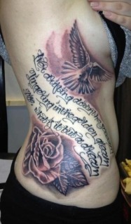
Great curves, nicely tattooed I still cant read half of it. Imagine how strong this would have been if she had just gone with the images
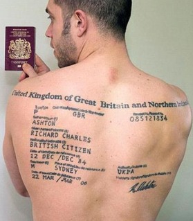
Like a business card printed on a billboard
The Wicked tattoo totally lives up to its name, but with all this fine art on a really fine canvas, why the full menu on the thigh?

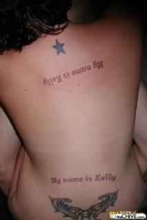
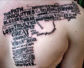
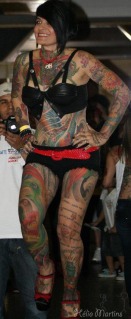
The last place my eye travels to on this photo is the largest part of her body, dead center in the middle of her back. Almost any image at that size would have blown you away,
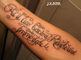
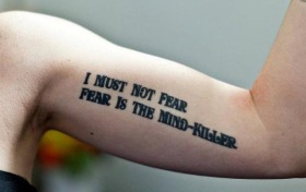
A full forearm, I still cant read it! (Yes, its in Italian, but if I have to ask Is that an N or a W? more than once, Im out!)
Good idea, on paper. But you can see what I mean, were not paper, the body makes this design even harder to read than it needs to be. Plus imagine this much skin in the hands of a master artist
Oh good Lord. Never mind about the worst use of negative space ever. Look how his muscles twist those lines like a Dr. Seuss drawing, Apologies, Mr. Ashton,
Not a lot of type, still, the letters run together, are different heights, slope right off the arm. And, is strangely justified to the left margin, which she doesnt have!
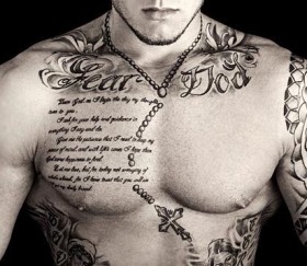
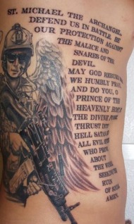
Weird paradox, as the well done Fear God is strong on the clavicles, but although tattooed clean, the rest is again strangely laid out with bizarre sentence breaks. And curves away from being readable as its sucked into the armpit. And kills a whole pec on lettering small enough to make me fetch my reading glasses.
Great work, great flow, fun looking stuff, on an even better looking girl, & then bam, right off the road into a railing of static text on her curvy calf. Look how much nicer the other leg is.
This artist is clearly decent, but even still, under this kind of onslaught, we still have issues with the letters bouncing around at different heights, letters stretching & squashing, strange sentence layouts, & lines flowing in & out of defined abs. Note how little you notice it happening to the IMAGE right next to it, even though the image is doing the exact same thing, its just so much less noticeable.
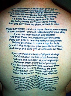
Cleanly tattooed, but again, look how the entire thing folds up. And look at the acres of skin it took to get there,
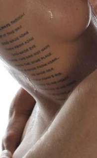
Ditto times 1000. Gods perfect curves, lanced by strangely justified sentences, tiny fonts, & rows of skin cutting lines, she could have been the Birth of Venus, nows she a Chinese take out menu. *sigh*
Again, all photos used for educational purposes.
Cut & paste this article as you see fit.
Heres to great tattooing!
You can read more about Johnny at Seppuku Tattoo.
While not in the original article, the image below is one of my favorite Johnny Thief posters; Hank III and Nashville Pussy.

Travelling is my life
ConversionConversion EmoticonEmoticon